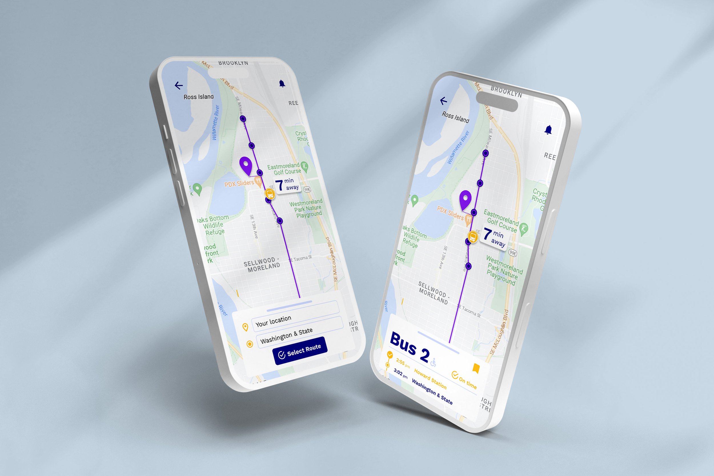
project overview
SUMMARY
This project consisted of creating a mobile bus app that is dedicated to 7 bus lines. Riders needed to know the bus arrival time, which bus to board and be able to view future arrival times.
PROJECT SCOPE
Project Type: Mobile App Design
Platform: Mobile
Deliverables: User Research, User Flows, Sketches, Wireframes, Logo
Tools: Pen & Paper, Adobe Illustrator, Figma
MY ROLE
User Research
UX Design
UI Design
Logo + Branding
THE PROBLEM
Riders don’t know which bus to board due to there being multiple at the stop at once, are missing the bus due to changes in the schedule and need real-time updates and map visibility.
THE SOLUTION
A mobile bus app that provides users the availability to view the schedule and details of 7 bus lines that also features real time updates.
Discovery & research
suMMARY OF RESEARCH
Competitive analysis
Google Forms survey
User personas
User stories
Competitive analysis
Reviewed other popular transportation apps:
Google Maps
CityMapper
Uber
Transit
Pros:
user friendly
featured an interactive map
had clear arrival time
real-time updates
Cons:
too much information
overwhelming amount of information on one screen
accessibility issues
User stories + task flows
I wrote numerous user stories which revealed overall needs and led to the sitemap and basic wireframes.
As a bus rider, I want to know when my bus is arriving at the stop, so I can calculate how much time I have to reach the bus stop.
As a bus rider, I want to know the next bus arriving at the Washington & State bus stop, so that I don’t rush to the bus stop if it is not my bus.
As a bus rider, I want the ability to view future arrival times for any of the seven bus lines (serving Washington & State), so that I know when my bus arrives.
user personas
Personas for this project represented a variety of potential bus riders.
Sketches + lo-fi wireframes
I translated my user flows and research into sketches and low-fidelity wireframes in Figma. The process resulted in and informed multiple iterations of the flow and design.
LOGO + BRANDING
I wanted riders to feel good and excited about using the app, so I coined the name “RideOn” like saying “Right on!” as a friendly response. Adding on to the friendliness, the logo is a smiling bus with an arch overhead, hinting toward movement.
The color palette is accessible and color blind safe. It is uplifting, invigorating and stands out.
I selected the font Work Sans because it is known to be optimized for on-screen text usage.
CONCLUSION
It all began with an idea and research. It ended with a user-friendly and simple mobile bus app.
I came out of this project with an understanding of how a designer works to create an app from start to finish, the user research methods that are implemented and the design processes and reiterations that occur in Figma.


